

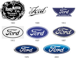
 Branding is a tricky thing to nail down — businesses can’t always get it right the first time. Even Google took their logo through several steps before going with the iconic colored moniker. But how about the automobile world? Vehicle giants like Ford and Audi started somewhere humble too, mind you. To get a handle on this idea, just read on for the evolution of popular car logos.
One of my favorite logos has to be the BMW brand. The “Bavarian Motor Works” company has an interesting logo story as well. You know how it displays the ever-popular circular design? Well, originally BMW was an aircraft business — but was forced to change models after World War I. The logo was representational of an airplanes spinning propeller! Check out this concept below.
The history of Mitsubishi is traced back to samurai in feudal Japan. Yes it’s true… the warriors used to bump around in compact autos slicing and dicing evil-doers. Well, not exactly, but the logo is based on the Iwasaki family crest. This family had to trade their samurai status to get out of debt, but the three stacked diamonds eventually found their way into Mitsubishi’s final logo in the mid 70’s. It’s closely reminiscent to the Tosa Clan crest, whose shipping business was acquired by the Iwasaki family in 1868. Combined, it’s the perfect trifecta of branding!
Buick and Saab’s logo evolution is a bit more complicated. For crying out loud, Saab goes through a dozen different versions! It’s interesting to see common elements which were kept (or totally lost) from generation to generation. Except for a rough spot in 1975, Buick really builds on top of a regal design. I’m still not quite sure where a bald eagle comes into play, but then again, it was the 70’s. We have some examples below, so check them out or view more here.
Tags: Mazda, Ford, BMW, car, logos, evolution, design, logo, brand, branding


