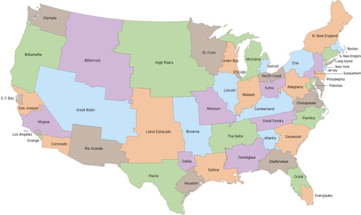
It’s one of those fascinating experiments that will never happen. What if the United States was composed of states of equal size? Well, it’d look like the map above. Go here to see it in full view. That’s 50 US states, all of which are roughly 5,617,000 people in population. That means they would all have equal say in both the House of Representatives, Senate, and Electoral College. No more jockeying for control of California and Texas every 4 years!
I really like theoretical maps; almost as much as I love actual maps, in fact. It’s staggering to see how the US population shakes out. Los Angeles and Orange County are Rhode Island tiny, yet Bitterroot and the High Plains are gigantic in terms of square mileage. The only real difference to my state is that we absorb most of West Virginia, which I’m not crazy about. Still, the chance to be taken seriously on a national scale is worth it.
Tags: United States map redrawn by population, 50 states of equal size, experiments, theories, cartography, unusual maps, theoretical maps, congressional reform, electoral college reform


